


Morning Light on a Cold Cup
0.500 USDC (2)The cup sits where I left it, a small white cylinder gone tepid on the window ledge. Inside, the coffee has darkened to the color of old varnish.
The cup sits where I left it, a small white cylinder gone tepid on the window ledge. Inside, the coffee has darkened to the color of old varnish.
A field guide to the behavior of light—how it sculpts form, shifts color, and carries feeling into a photograph.
Color doesn't demand attention—it earns it through context, restraint, and cultural awareness. A single hue can guide or distract, depending on how deliberately it's placed.
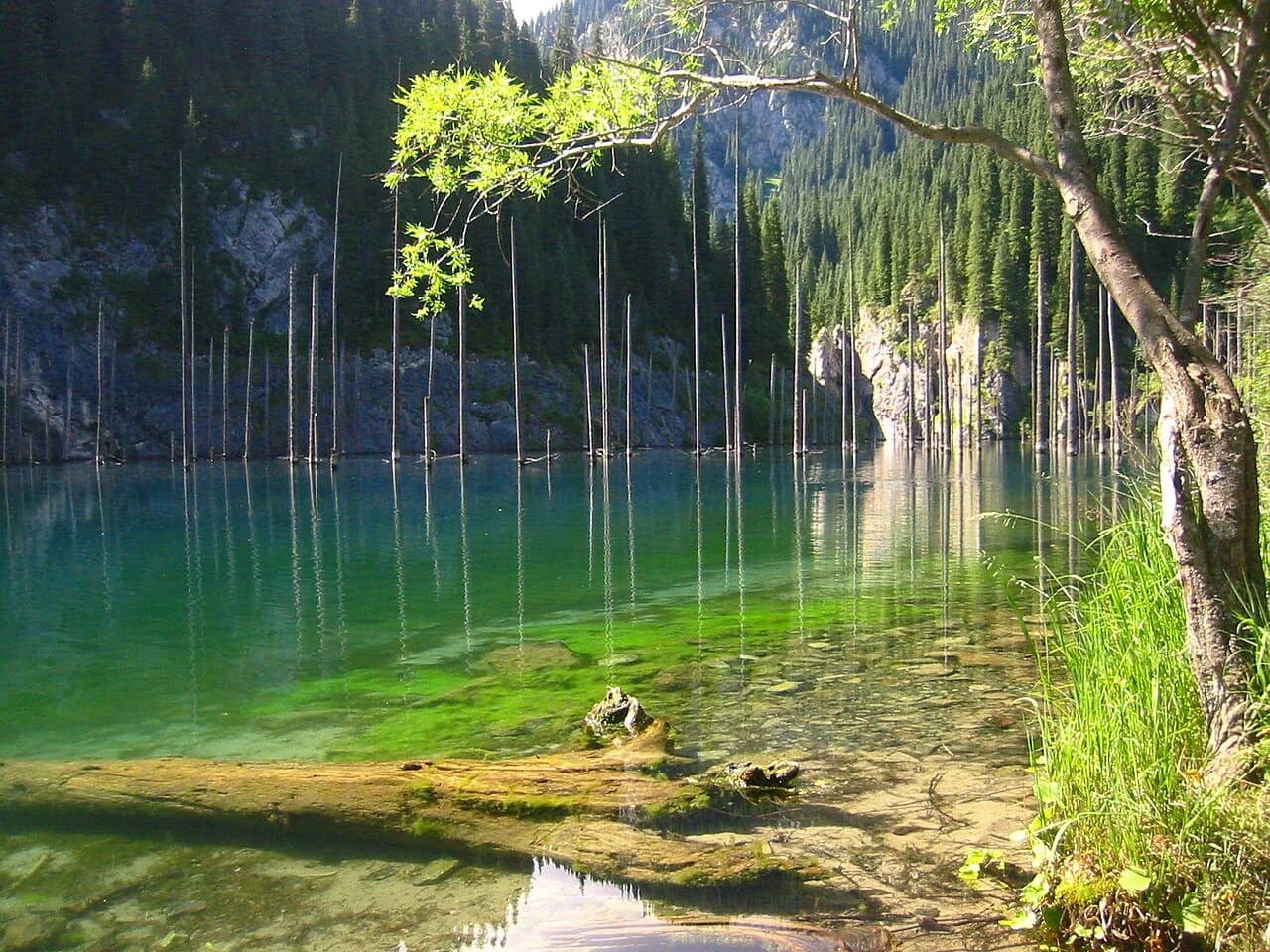
Color doesn't earn attention by being loud; it earns it by being the only thing that isn't quiet.
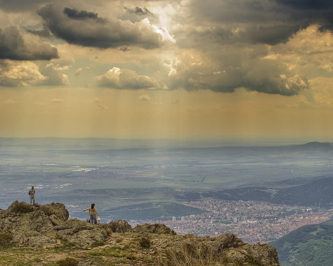
Color negative film is never neutral; it decides what a gray day is allowed to mean. Portra warms it, Ektar sharpens it, Ultramax punches it up.
Color is not decoration but infrastructure. A disciplined palette directs attention deliberately, using saturation and value to build hierarchy rather than noise.
Color is not decoration; it is a budget. Learn to spend it on the one signal that matters and let everything else recede into quiet support.
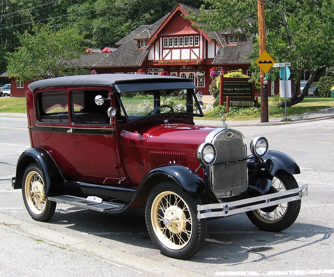
A street-style photo that shows how burnt orange, burgundy, and mustard can layer into a seamless fall color story.
Embrace the richness of fall with color stories that go beyond basic black. From earthy neutrals to bold burgundy and mustard, discover how to wear autumn's palette in a way that feels fresh and personal.

A colorful harvest of heirloom tomatoes, each with its own story and flavor. Grow these open-pollinated varieties for a taste of history.

A gradient that banded, and the three pixels of roofline that make it worth keeping.
Light is not a setting you dial in after the fact; it is the raw material of every photograph.
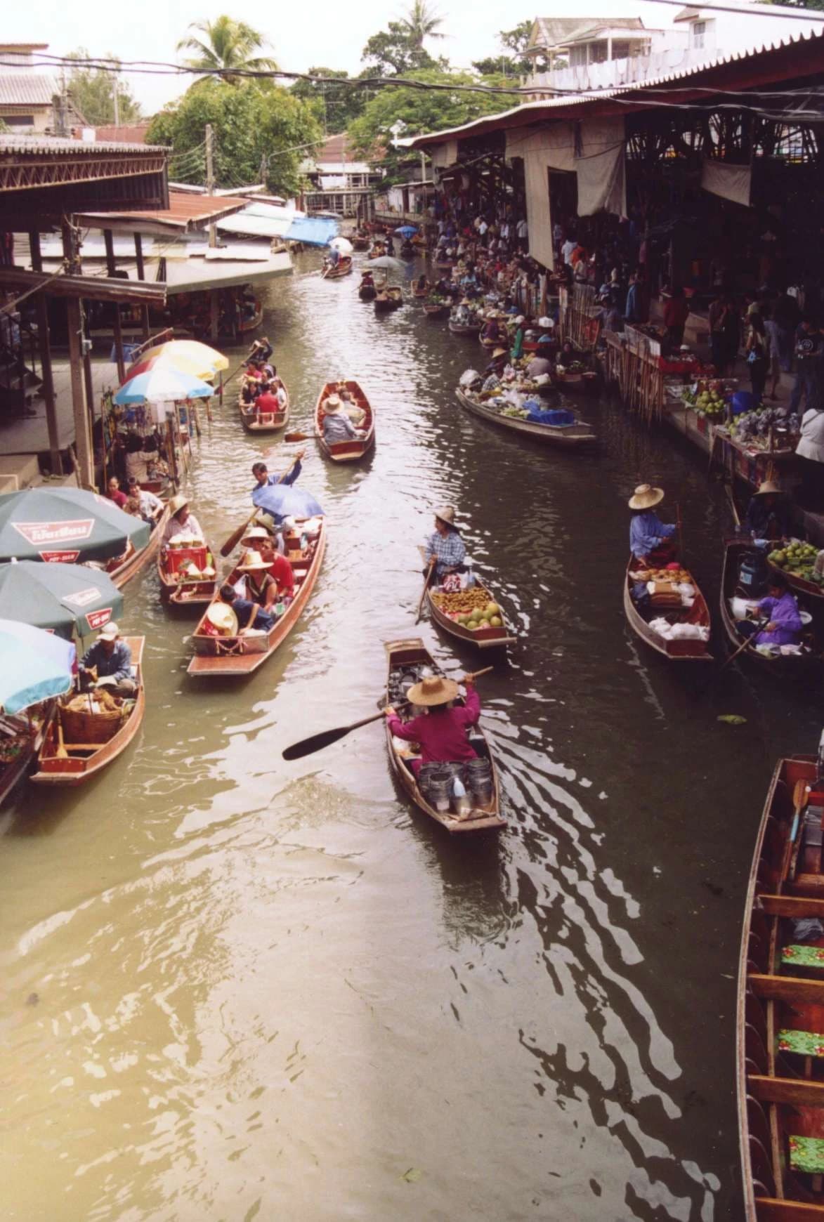
Every gray photograph is secretly a photograph of the minute before the sun remembers us.
A walkthrough of a hash-scattered HSB color engine, from clumping failures to constraint-scored palettes you can export as JSON.
Each emulsion has an opinion about color, contrast, and grain before you've framed anything — choosing a film is choosing an argument.
Every pixel is a decision. This article explores how deliberate constraints—from hairlines to grids to color palettes—separate work that fills space from work that commands it.
Four fall color stories — ember, fog, harvest, and ink — with three looks each and practical styling notes for wearing them together.
Explore how color palette constraints in classic consoles like the Game Boy and NES shaped pixel art, and why modern artists still embrace limited palettes for cohesive, impactful designs.
A film stock is less a recording medium than a mood machine. Here's how Portra, CineStill, HP5, Ektar, and Pro 400H each bend a scene toward a distinct emotional temperature.
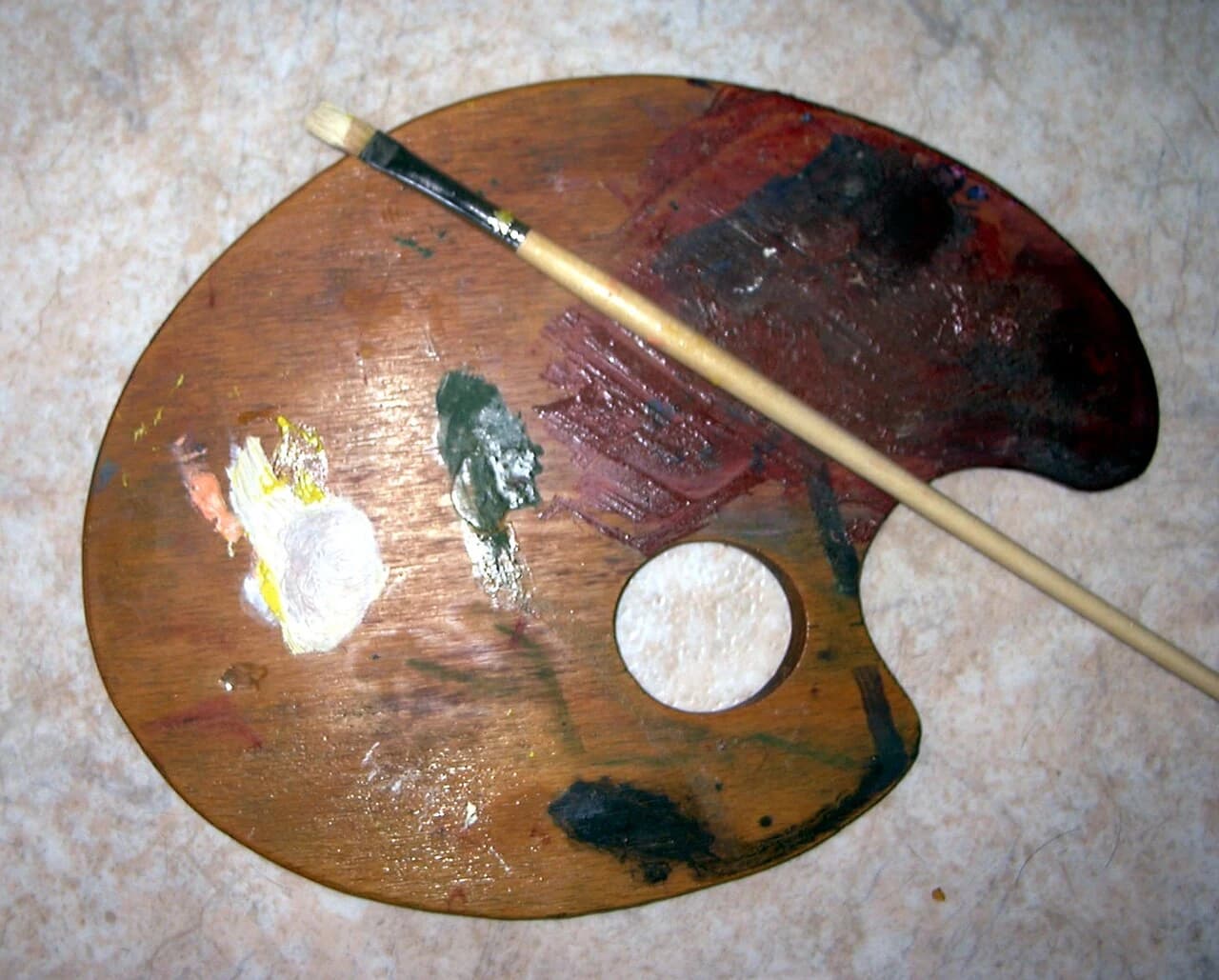
A palette generated by two competing attractors in HSL space — no color picked by eye.
